Amazing and simple hover effects in pure CSS
Maria Skrzypek-Markiewicz | 2023-07-11You don't need any tools or superpowers to improve your web app in a short time. In this article, you will find some mind-blowing yet extremely simple hover effects written in pure CSS and HTML, without any JavaScript.
In CSS, a hover effect refers to the change in the appearance of an element on a web page when the user's mouse pointer hovers over it. Its purpose is to add visual interest and interactivity to a page, making it more engaging for users.
Enlarge image on hover
This hover effect is impressive yet very simple. Hovering on the image suggests the user they can see something more after clicking on it.
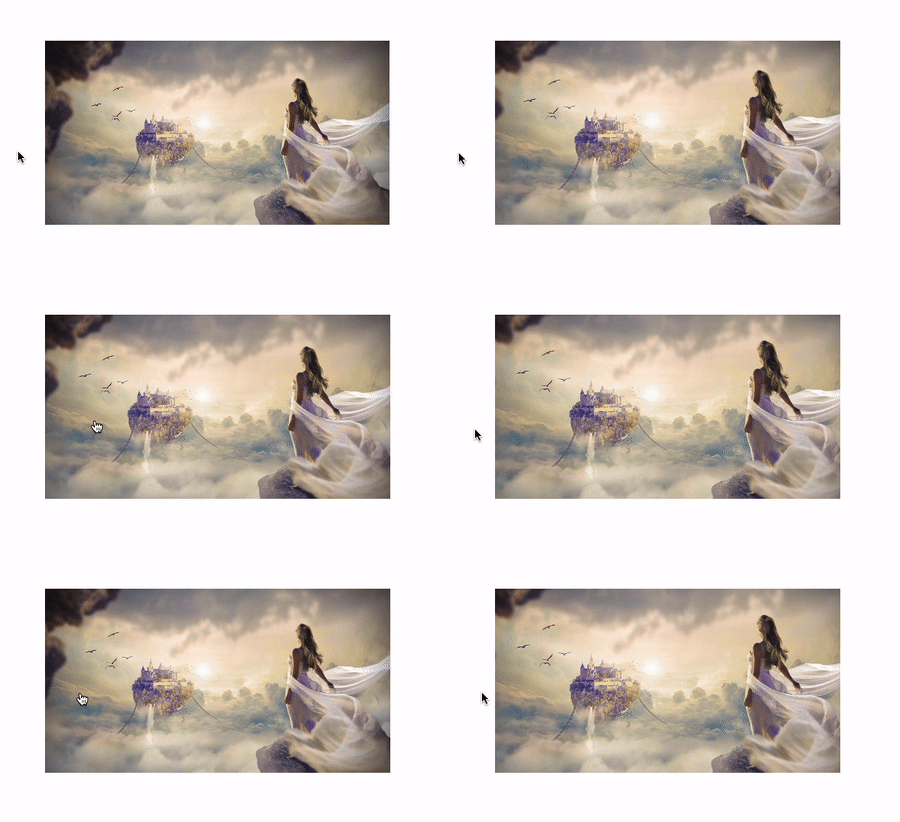
<!-- for this effect to work, the image must be in a box -->
<div class="imageBox">
  <img src="./example-image.jpeg" />
</div>
.imageBox {
  width: 300px;
  height: 160px;
  /* important property, hides overflowing sides */
  overflow: hidden;
}

img {
  width: 100%;
  transition: 0.3s ease-in-out;
  cursor: pointer;
  object-fit: cover;
}

img:hover {
  /* mportant property, you can change the transform effect meet your preferences */
  transform: scale(1.2);
  transition: 0.3s ease-in-out;
}
Change opacity on hover
The above effect is straightforward, whereas the transition property looks elegant.
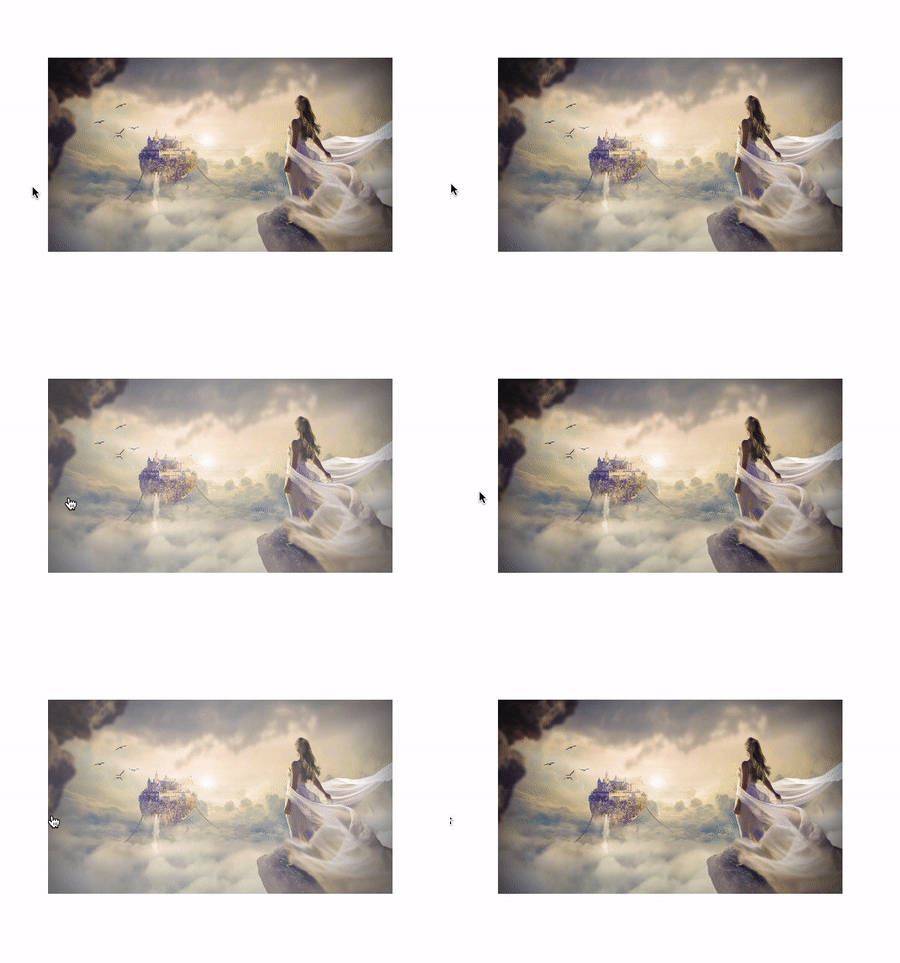
<div class="imageBox">
  <img src="./example-image.jpeg" />
</div>
.imageBox {
  width: 300px;
  height: 160px;
}

img {
  width: 100%;
  transition: 0.3s ease-in-out;
  cursor: pointer;
  object-fit: cover;
}

img:hover {
  /* here you can change the opacity */
  opacity: 0.8;
  transition: 0.3s ease-in-out;
}
Change opacity with color on hover
This effect is very similar to the previous one. However, it looks different due to an additional property.
Add background: red; to .imageBox to change opacity with color;

Show image on hover
Maybe you want to show an image after hovering? You may do it with pure CSS! You can fill not hovered empty spaces with whatever you like. Maybe some color or another image? In this example, we used :after pseudo-element, though you can also add another div in HTML and change its opacity to 1. Alternatively, add a background image after hovering :)
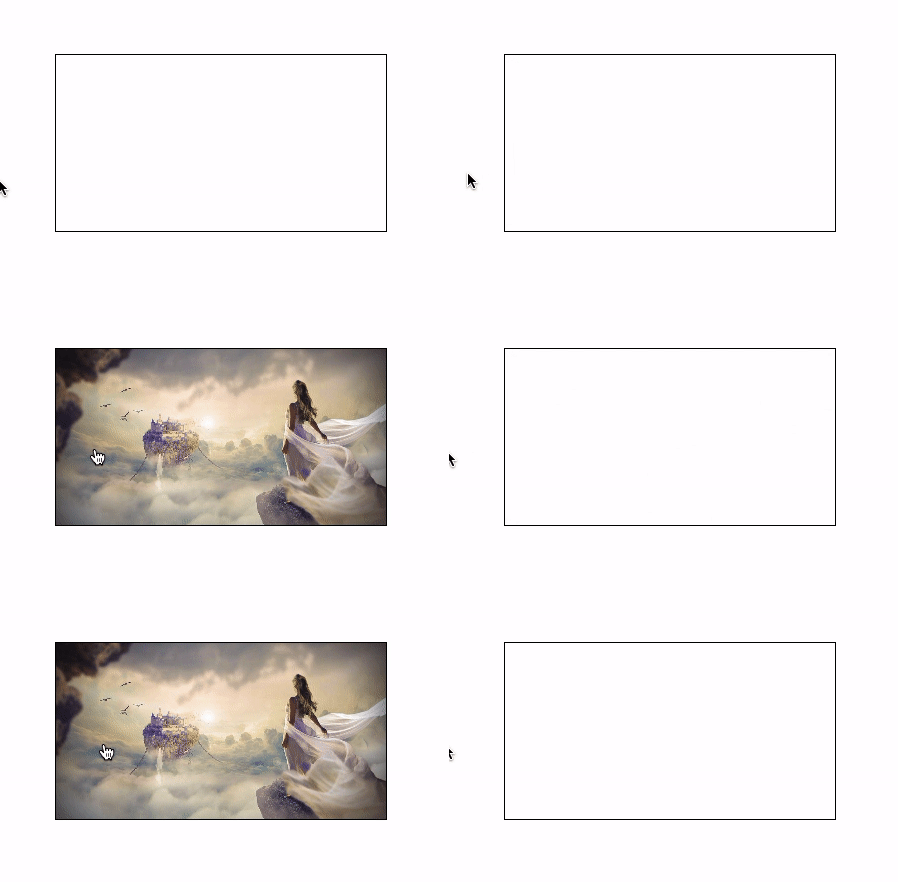
<div class="imageBox" />
.imageBox {
  width: 300px;
  height: 160px;
  position: relative;
  border: 1px solid black;
  transition: 0.3s ease-in-out;
  cursor: pointer;
}
.imageBox:after {
  position: absolute;
  content: '';
  width: 100%;
  height: 100%;
  background-image: url("./example-image.jpeg");
  background-position: center;
  background-size: cover;
  left: 0;
  top: 0;
  opacity: 0;
  transition: 0.3s ease-in-out;
}
.imageBox:hover:after {
  transition: 0.3s ease-in-out;
  opacity: 1;
}
Show title on hover
Here we are making another div visible after hover (literally, we change its opacity to 1). Such a trick is powerful and very simple, and it for sure adds up to the effectiveness of the application. Try to play for a while with this effect. You can change the transition to something else or make a div with the class title a full height. You can even show icons or images instead of text.

<div class="imageBox">
  <img src="./example-image.jpeg" />
  <div class="title">Image title</div>
</div>
.imageBox {
  width: 300px;
  height: 160px;
  position: relative;
}
img {
  width: 100%;
  cursor: pointer;
  object-fit: cover;
}
.title {
  box-sizing: border-box;
  position: absolute;
  background: rgb(0, 0, 0);
  background: rgba(0, 0, 0, 0.5);
  color: #f1f1f1;
  width: 100%;
  padding: 1rem;
  top: 0;
  opacity: 0;
  cursor: pointer;
  text-align: center;
  transition: 0.3s ease-in-out;
}
.imageBox:hover .title {
  opacity: 1;
  transition: 0.3s ease-in-out;
}
There are many possible usages of hover effects in CSS, including changing the appearance of text, buttons, and other elements on a page. Using hover effects, you can add an extra layer of interactivity and engagement to your website.
In the examples listed above, we exclusively used transition effects. You can read more about the transition CSS property here: https://developer.mozilla.org/en-US/docs/Web/CSS/transition.
If you look for more dynamic effects, take a glance at CSS animations: https://developer.mozilla.org/en-US/docs/Web/CSS/CSS_Animations/Using_CSS_animations :)
Maria
